AI assistant

An illustrative sketch of a flower

overview

Designed an AI assistant product that connected to a system MCP in order to provide insights and clues about site performance. The dataset for this site was massive so being able to query the assistant to get those insights without having to parse through large reports was a huge win. The assistant was not implemented cross-platform but was its own page within the system.

​

Role: lead designer

Timeline: five months

Team: one product manager, four developers, one other designer

Tools: Figma

problem

The system had a lot of data that was not accessible to users in any easy-to-read way. There were also no AI-related tools in the system to this point. Management felt like it would be a good way to not only thoughtfully include AI in the system, but also a way to expose more data than users were used to.

goals and constraints

Introduce AI to users in a way that was actually helpful

​

Provide AI-generated insights to users upon login, in order to get them interested in interacting with the assistant directly

​

Constraints: not every client was interested in AI tools, and many did not want their data exposed to LLM-based tools in any way.

users and research

Because of the limited number of partners interested in this feature, I was only able to conduct a single client interview. Prototypes were shown and the feedback was generally positive at the time – the UI/UX made sense and the insights were useful. However, one big point of feedback was that the recommendation usefulness was “really dependent on the person making decisions.” This required dev to rework the assistant prompt in a way that provided actionable insights vs generic info that would be ignored.

key decisions

Begin with a standalone page vs system-wide access: The team decided to have this tool sit separately in the system via opt-in menu option to start. This was to alleviate privacy concerns, and also to accommodate clients hesitant about the technology.

​

Platform-wide UI. Initially, the designs for this product and other company AI tools were going to use design styling tied to each brand’s UI. However, a pivot during design resulted in the same colors, typography, and animations being used for all AI-related projects. It was a sign that the tool was new but also unified across all brands.

​

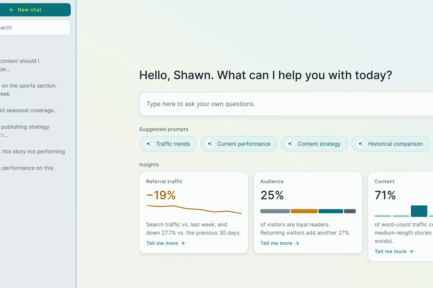
Include insights on the prompt page. Initial designs offered users a text-entry box, along with canned questions, to give users examples of what they can ask the assistant. As a team we decided that having fewer canned questions and including insights that could also act as canned questions was a better UX. It was a win for users who saw the updates. They preferred them over the original designs.

solution

The final page design includes a side bar with the ability to search, start new conversations, and access historical chats with the assistant. There is also a large text-entry box below a welcome message, but above four canned questions which populate when the user hovers over the chip and above the three insights that can be clicked on to begin a conversation.

reflection

While this project was fun there were challenges related to changing direction during the design process. Requirements continually changed, often by the week, and there was not a PRD until very late into the design process. That aside, it was rewarding to see people enjoy using the product, and I was grateful to work with another designer with experience in designing AI tools because I learned so much from her. Prior to this, I had zero experience with the tools, so the design process was a bit of a blind spot until recently.

AI assistant

An illustrative sketch of a flower

overview

Designed an AI assistant product that connected to a system MCP in order to provide insights and clues about site performance. The dataset for this site was massive so being able to query the assistant to get those insights without having to parse through large reports was a huge win. The assistant was not implemented cross-platform but was its own page within the system.

​

Role: lead designer

Timeline: five months

Team: one product manager, four developers, one other designer

Tools: Figma

problem

The system had a lot of data that was not accessible to users in any easy-to-read way. There were also no AI-related tools in the system to this point. Management felt like it would be a good way to not only thoughtfully include AI in the system, but also a way to expose more data than users were used to.

goals and constraints

Introduce AI to users in a way that was actually helpful

​

Provide AI-generated insights to users upon login, in order to get them interested in interacting with the assistant directly

​

Constraints: not every client was interested in AI tools, and many did not want their data exposed to LLM-based tools in any way.

users and research

Because of the limited number of partners interested in this feature, I was only able to conduct a single client interview. Prototypes were shown and the feedback was generally positive at the time – the UI/UX made sense and the insights were useful. However, one big point of feedback was that the recommendation usefulness was “really dependent on the person making decisions.” This required dev to rework the assistant prompt in a way that provided actionable insights vs generic info that would be ignored.

key decisions

Begin with a standalone page vs system-wide access: The team decided to have this tool sit separately in the system via opt-in menu option to start. This was to alleviate privacy concerns, and also to accommodate clients hesitant about the technology.

​

Platform-wide UI. Initially, the designs for this product and other company AI tools were going to use design styling tied to each brand’s UI. However, a pivot during design resulted in the same colors, typography, and animations being used for all AI-related projects. It was a sign that the tool was new but also unified across all brands.

​

Include insights on the prompt page. Initial designs offered users a text-entry box, along with canned questions, to give users examples of what they can ask the assistant. As a team we decided that having fewer canned questions and including insights that could also act as canned questions was a better UX. It was a win for users who saw the updates. They preferred them over the original designs.

solution

The final page design includes a side bar with the ability to search, start new conversations, and access historical chats with the assistant. There is also a large text-entry box below a welcome message, but above four canned questions which populate when the user hovers over the chip and above the three insights that can be clicked on to begin a conversation.

reflection

While this project was fun there were challenges related to changing direction during the design process. Requirements continually changed, often by the week, and there was not a PRD until very late into the design process. That aside, it was rewarding to see people enjoy using the product, and I was grateful to work with another designer with experience in designing AI tools because I learned so much from her. Prior to this, I had zero experience with the tools, so the design process was a bit of a blind spot until recently.